Google’s material design brings with it new, exciting ways to delight
your users with a visually appealing Android app. But wait—what is
material design?
Google introduced material design in last year’s I/O, describing it
as an interface that incorporates “tactile surfaces, bold graphic design
and fluid motion to create beautiful, intuitive experiences.” Material
design is the new “user experience philosophy” for Android apps!
In this tutorial, you’ll integrate material design into an app called Travel Wish List. Along the way, you’ll learn how to:
- Implement the material theme;
- Build dynamic views using new widgets like
RecyclerView and CardView;
- Use Palette API to generate color schemes that you can use for text or background views;
- Create delightful interactions using the new animation APIs.
This tutorial assumes you have a basic familiarity with Android
programming including Java, XML, Android Studio and Gradle. If you’re
completely new to Android, you might want to go through our
Android Tutorial for Beginners: Part 1 first.
Let’s get started!
Getting Started
Download the
starter project, then fire up
Android Studio.
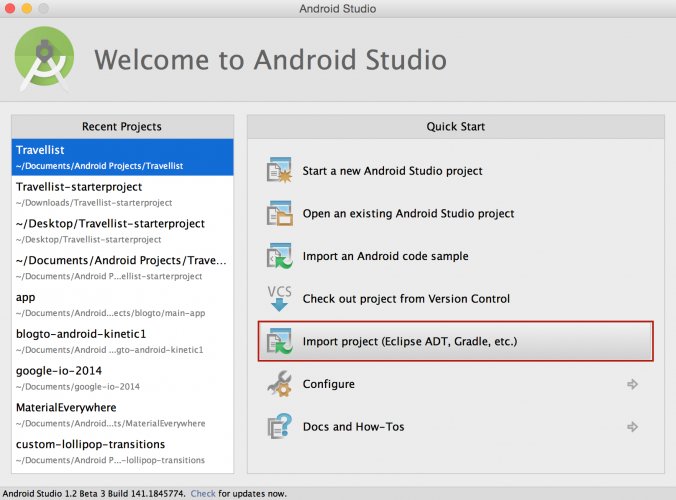
To import the starter project, first select
Import project from the
Quick Start menu:
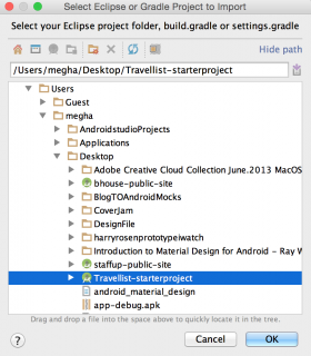
Then select the downloaded project and click
OK:
Travel Wish List will be a very simple app. Users will see a grid of
pictures from locations around the world, and be able to tap each
picture to add notes about what to do and see.
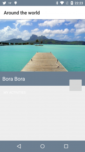
Build and run the starter project, swipe up to get past the lock
screen, and you should see a screen with the most basic of interfaces:
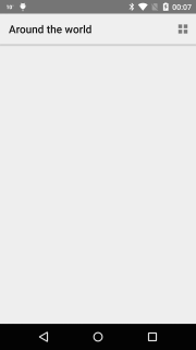
Right now, the world is empty! You’re going to add material
components to this existing project, including dynamic views, color
schemes and animations that will truly complement the beauty of the
photos in your dataset.
Open
build.gradle for the app module and add the following:
dependencies {
  compile fileTree(dir: 'libs', include: ['*.jar'])
  compile 'com.android.support:recyclerview-v7:21.+'
  compile 'com.android.support:cardview-v7:21.+'
  compile 'com.android.support:palette-v7:21.0.0'
  compile 'com.squareup.picasso:picasso:2.5.0'
}
|
Here you’re simply declaring the dependencies that you’ll use
throughout the rest of the tutorial. The first few are Google-provided
APIs, but the final one,
Picasso, is a fantastic image downloading and caching library provided by the good folks at
Square.
With the dependencies declared, it’s time to begin incorporating Material Design into your app!
Setting Up the Theme
Before doing anything else, you should set up your theme. Open
style.xml under the
values directory. By default, the theme selected is
android:Theme.Material.Light. Add the following items inside the theme tag:
<item name="android:colorPrimary">@color/primary</item>
<item name="android:colorPrimaryDark">@color/primary_dark</item>
<item name="android:colorAccent">@color/accent</item>
<item name="android:navigationBarColor">@color/primary_dark</item>
<item name="android:displayOptions">disableHome</item>
|
Android will automatically apply
android:colorPrimary to the action bar,
android:colorPrimaryDark to status bar and
android:colorAccent to UI widgets like textfield and checkboxes.
In the code above, you also alter the color of the navigation bar. For
android:displayOptions, you pass
disableHome to accommodate the screen layouts in this sample app.
Build and run, and you’ll see the new color scheme in the app.
It’s a subtle change, but like every trip on your travel wish list, upgrading this design begins with a single step!
Using the Recycler and Card Views
To give your users a window into all the cool places they might go, you need a view. You can use
RecyclerView as a replacement for
ListView, but it’s much more versatile than that. Google describes
RecyclerView
as “a flexible view for providing a limited window into a large data
set.” In this section, you’re going to demonstrate this by switching the
view from a list to a custom grid that uses the same data source which
currently supplies the
ListView with the users locations.
Implementing a Recycler View in XML
First, open
activity_main.xml and add the following inside the
LinearLayout tag:
<android.support.v7.widget.RecyclerView
  android:id="@+id/list"
  android:layout_width="match_parent"
  android:layout_height="match_parent"
  android:background="@color/light_gray"/>
|
Here you’re adding a
RecyclerView to the activity’s layout, and specifying it should match the entire size of the parent view.
Initializing a Recycler View and Applying a Layout Manager
Before adding Java code, configure Android Studio so that it
automatically inserts import statements to save you having to add each
one manually.
Go to
Preferences\Editor\General\Auto Import and select the
Add unambiguous imports on the fly checkbox. In
MainActivity.java, add the following to the top of the class:
private RecyclerView mRecyclerView;
private StaggeredGridLayoutManager mStaggeredLayoutManager;
|
Here you’re simply declaring two fields; one to hold a reference to the
RecyclerView and another to hold a reference to the
LayoutManager.
Next, add the following to the bottom of
onCreate():
mRecyclerView = (RecyclerView) findViewById(R.id.list);
mStaggeredLayoutManager = new StaggeredGridLayoutManager(1, StaggeredGridLayoutManager.VERTICAL);
mRecyclerView.setLayoutManager(mStaggeredLayoutManager);
|
In the code above, you initialize
RecyclerView and apply
StaggeredGridLayout to it, which you’ll use to create two types of vertically staggered grids. Here you start with the first type, passing
1 for the span count and
StaggeredGridLayoutManager.VERTICAL
for the orientation. A span count of 1 makes this a list rather than a
grid, as you’ll soon see. Later, you’ll add a compact grid formation
with two columns.
Creating Rows and Cells Using a Card View
CardView provides a consistent backdrop for your views,
including rounded corners and a drop shadow. You’re going to implement
it for the row/cell layout of your
RecyclerView. By default,
CardView extends
FrameLayout and therefore includes the ability to host other child views.
From the
res\layout directory, create a new
Layout resource file and call it
row_places.xml. Press
OK to create it.
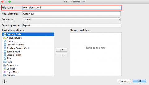
To create your desired cell layout, replace all the contents of this file with the code below:
<?xml version="1.0" encoding="utf-8"?>
<android.support.v7.widget.CardView
  xmlns:android="http://schemas.android.com/apk/res/android"
  xmlns:card_view="http://schemas.android.com/apk/res-auto"
  android:id="@+id/placeCard"
  android:layout_width="match_parent"
  android:layout_height="wrap_content"
  android:layout_margin="8dp"
  card_view:cardCornerRadius="@dimen/card_corner_radius"
  card_view:cardElevation="@dimen/card_elevation">

    <ImageView
      android:id="@+id/placeImage"
      android:layout_width="match_parent"
      android:layout_height="200dp"
      android:scaleType="centerCrop" />

    <!-- Used for the ripple effect on touch -->
    <LinearLayout
      android:id="@+id/mainHolder"
      android:layout_width="match_parent"
      android:layout_height="match_parent"
      android:background="?android:selectableItemBackground"
      android:orientation="horizontal" />

    <LinearLayout
      android:id="@+id/placeNameHolder"
      android:layout_width="match_parent"
      android:layout_height="45dp"
      android:layout_gravity="bottom"
      android:orientation="horizontal">

      <TextView
        android:id="@+id/placeName"
        android:layout_width="match_parent"
        android:layout_height="wrap_content"
        android:layout_gravity="center_vertical"
        android:gravity="left"
        android:paddingLeft="10dp"
        android:textAppearance="?android:attr/textAppearanceLarge"
        android:textColor="@android:color/white" />

    </LinearLayout>

</android.support.v7.widget.CardView>
|
By adding
xmlns:card_view="http://schemas.android.com/apk/res-auto", you can define attributes like
card_view:cardCornerRadius and
card_view:cardElevation that are responsible for giving Material Design enabled Android apps their signature card-like look.
Notice that for
mainHolder, you’ve added
?android:selectableItemBackground as the background. This enables the
ripple effect animation when the user touches a cell, as seen in many Android apps now. You’ll get to see it in action soon.
Implementing an Adapter for a Recycler View
You’re going to use an adapter for the
RecyclerView to bind data to the view. In the
Java folder, right-click on the
bhouse.travellist_starterproject package and select
New\Java class. Call the class
TravelListAdapter.
Add the following code to the class, taking care to preserve the package statement at the top of the file:
// 1
public class TravelListAdapter extends RecyclerView.Adapter<TravelListAdapter.ViewHolder> {

  Context mContext;

  // 2
  public TravelListAdapter(Context context) {
    this.mContext = context;
  }

  // 3
  public class ViewHolder extends RecyclerView.ViewHolder {
    public LinearLayout placeHolder;
    public LinearLayout placeNameHolder;
    public TextView placeName;
    public ImageView placeImage;

    public ViewHolder(View itemView) {
      super(itemView);
      placeHolder = (LinearLayout) itemView.findViewById(R.id.mainHolder);
      placeName = (TextView) itemView.findViewById(R.id.placeName);
      placeNameHolder = (LinearLayout) itemView.findViewById(R.id.placeNameHolder);
      placeImage = (ImageView) itemView.findViewById(R.id.placeImage);
    }
  }
}
|
A couple of things are happening above:
- You make
TravelListAdapter extend Recycler.Adapter so that you can implement logic for the override methods you’ll add soon.
- You add a constructor where the
context can be passed when you create an instance of TravelListAdapter in MainActivity, which you’ll do a bit later in the tutorial.
- You create the
ViewHolder class. Whereas the use of the ViewHolder pattern is optional in ListView, RecyclerView enforces it. This improves scrolling and performance by avoiding findViewById() for each cell.
Because your adapter subclasses
RecyclerView.Adapter, you need to add the following methods to
TravelListAdapter:
// 1
@Override
public int getItemCount() {
  return new PlaceData().placeList().size();
}

// 2
@Override
public ViewHolder onCreateViewHolder(ViewGroup parent, int viewType) {
  View view = LayoutInflater.from(parent.getContext()).inflate(R.layout.row_places, parent, false);
  return new ViewHolder(view);
}

// 3
@Override
public void onBindViewHolder(final ViewHolder holder, final int position) {
  final Place place = new PlaceData().placeList().get(position);
  holder.placeName.setText(place.name);
  Picasso.with(mContext).load(place.getImageResourceId(mContext)).into(holder.placeImage);
}
|
Here’s what’s happening:
getItemCount() returns the number of items from your data array. In this case, you’re using the size of the PlaceData.placeList().onCreateViewHolder(...) returns a new instance of your ViewHolder by passing an inflated view of row_places.onBindViewHolder(...) binds the Place object to the UI elements in ViewHolder. You’ll use Picasso to cache the images for the list.
Add a field in
MainActivity that will hold a reference to your adapter:
private TravelListAdapter mAdapter;
|
And then create an instance of your adapter and pass it to the
RecyclerView at the bottom of
onCreate(), just after you configure the layout manager:
mAdapter = new TravelListAdapter(this);
mRecyclerView.setAdapter(mAdapter);
|
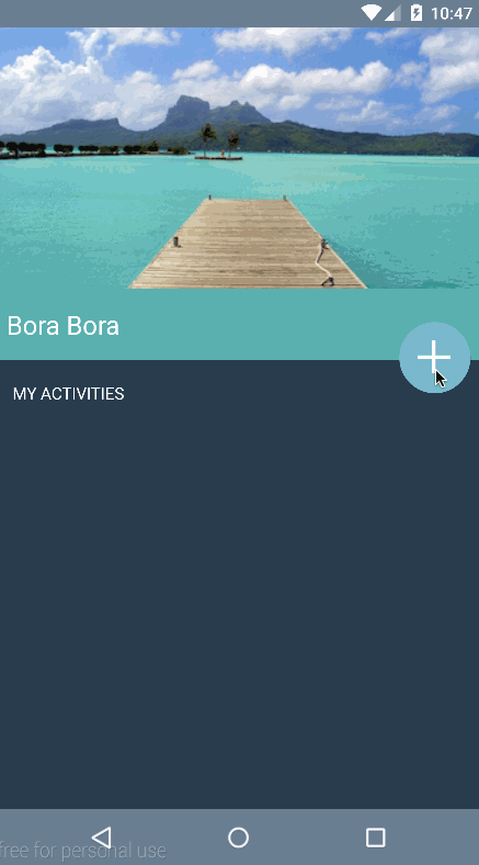
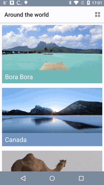
Now build and run the app, and you’ll see a populated list of places.
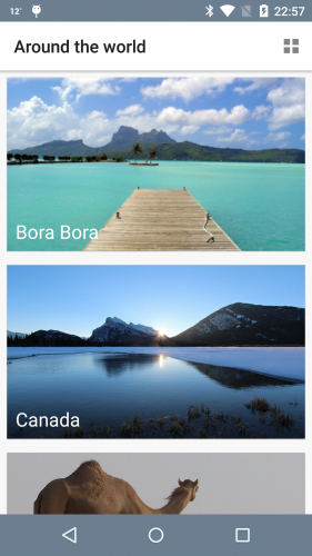
Which place is calling your name? I like the look of that turquoise
water. But wherever you want to go, you’ll want to cultivate your dream
by taking notes about what to do there. First, you need to make the
cells respond to a user’s touch.

Implementing a Click Interface for Each Cell
Unlike
ListView,
RecyclerView doesn’t come with an
onItemClick interface, so you have to implement one in the adapter. In
TravelListAdapter, create a field to hold an instance of
OnItemClickListener. Add the following just below the existing fields:
OnItemClickListener mItemClickListener;
|
Now implement
View.OnClickListener by adding the interface to the
ViewHolder inner class definition like this:
public class ViewHolder extends RecyclerView.ViewHolder implements View.OnClickListener {
|
Then add the following method stub to the inner
ViewHolder class:
@Override
public void onClick(View v) {

}
|
Finally, hook the two up by adding the following to the bottom of
ViewHolder():
placeHolder.setOnClickListener(this);
|
Above, you initiate
setOnClickListener for
placeHolder and implement the
onClick override method.
You need to do a few more things to implement the
onClick interface for the
RecyclerView. First, after the inner
ViewHolder class definition add the following:
public interface OnItemClickListener {
  void onItemClick(View view, int position);
}
|
Next, add the setter method of the
onClickListener:
public void setOnItemClickListener(final OnItemClickListener mItemClickListener) {
  this.mItemClickListener = mItemClickListener;
}
|
Now implement the logic in the empty
onClick() stub
within the inner
ViewHolder class:
if (mItemClickListener != null) {
  mItemClickListener.onItemClick(itemView, getPosition());
}
|
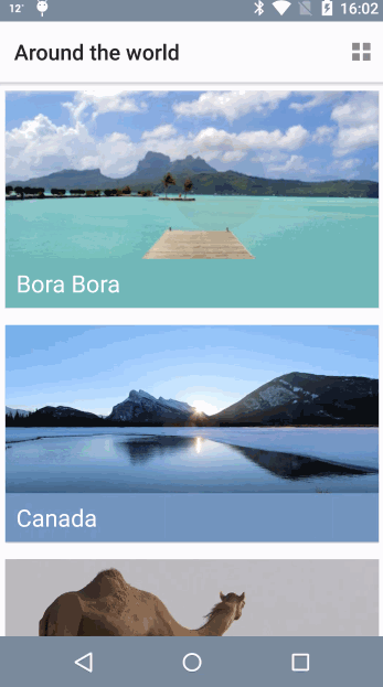
Build and run the app. Notice the new ripple effect every time you touch a row:
In
MainActivity, create an instance of
OnItemClickListener below
onCreate():
TravelListAdapter.OnItemClickListener onItemClickListener = new TravelListAdapter.OnItemClickListener() {
  @Override
  public void onItemClick(View v, int position) {
    Toast.makeText(MainActivity.this, "Clicked " + position, Toast.LENGTH_SHORT).show();
  }
};
|
Finally, set the listener to the adapter by adding the following code to the bottom of
onCreate(), just after where you set the adapter:
mAdapter.setOnItemClickListener(onItemClickListener);
|
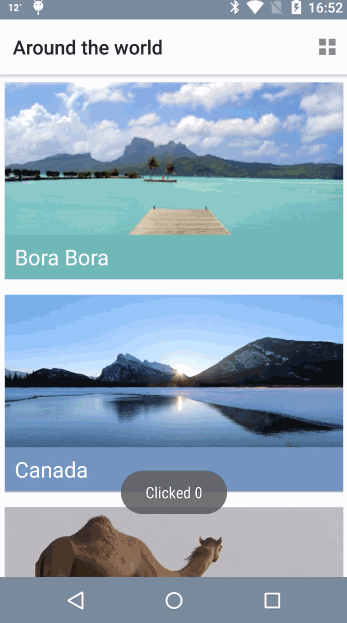
Build and run once more. Now when you tap a cell you’ll see a Toast
notification displaying the position of the cell in the list.
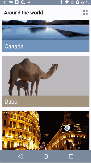
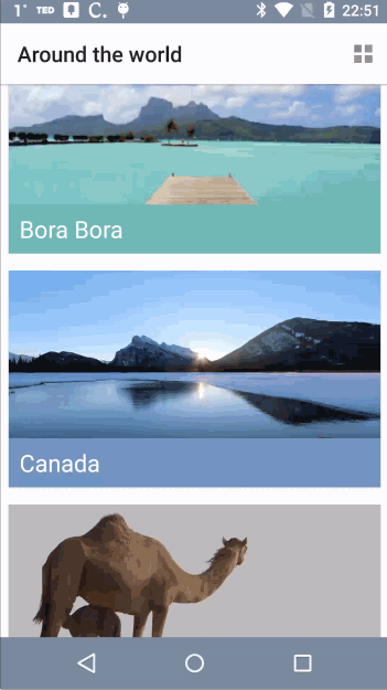
From List to Grid and Back
StaggeredLayoutManager lets you add versatility to your
layouts. To change your existing list to a more compact two-column grid,
you simply have to change the
spanCount of the
mLayoutManager in
MainActivity.
In
toggle(), add the following to the top of the
if:
mStaggeredLayoutManager.setSpanCount(2);
|
And now add the following to the top of the
else branch:
mStaggeredLayoutManager.setSpanCount(1);
|
Here you’re simply switching between single and double span counts, which displays single and double columns respectively.
Build and run and use the action bar button to toggle between list and grid views.

Using the Palette API in the List
Now you can add some interesting Material Design features into the mix, starting with the Palette API. Head back to
TravelListAdapter, where you’ll define a background color for
placeNameHolder that will be determined dynamically using the colors in the image.
Add the following to the bottom of
onBindViewHolder(...):
Bitmap photo = BitmapFactory.decodeResource(mContext.getResources(), place.getImageResourceId(mContext));

Palette.generateAsync(photo, new Palette.PaletteAsyncListener() {
  public void onGenerated(Palette palette) {
    int bgColor = palette.getMutedColor(mContext.getResources().getColor(android.R.color.black));
    holder.placeNameHolder.setBackgroundColor(bgColor);
  }
});
|
By using
generateAsync(...) to generate a color palette in the background, you’ll receive a callback when the palette has been generated in the form of
onGenerated(...). Here you can access the generated color palette and set the background color of
holder.placeNameHolder. If the color doesn’t exist, the method will apply a fallback color — in this case,
android.R.color.black.
Build and run to see the Palette API in action!

Note: The Palette API can extracts the following color profiles from an image:
- Vibrant
- Vibrant Dark
- Vibrant Light
- Muted
- Muted Dark
- Muted Light
I encourage you to experiment with these. Instead of
palette.getMutedColor(...), try
palette.getVibrantColor(...),
palette.getVibrantDark(...) and so on.
Using the New Material APIs
In this section, you’ll use
DetailActivity and its corresponding
activity_detail layout, and make them cooler by infusing some of the new Material Design APIs.
First, you’ll want to see how the detail view currently looks in the starter project. To see this, go to
MainActivity and create an intent in
onItemClickListener. Add the following to the bottom of
onItemClick(...):
Intent intent = new Intent(MainActivity.this, DetailActivity.class);
intent.putExtra(DetailActivity.EXTRA_PARAM_ID, position);
startActivity(intent);
|
You can pass the position of the place object via the intent so that
DetailActivity can retrieve the information and use it to layout the interface. That’s what you’re doing here.
Build and run.
There isn’t anything crazy going on here (
yet!), but you’ve
got a nice foundation on which to start adding those highly anticipated
Material Design APIs, beginning with a floating action button.
Adding a Floating Action Button with Ripple Effect
The floating action button (FAB) pattern is common to most Android
apps, such as Gmail, Calendar and Drive. It is essentially the main call
to action on the screen.
Create a new drawable resource file under
res\drawable. Call the file
btn_background.xml and define
ripple as the root element, like below:
<?xml version="1.0" encoding="utf-8"?>
<ripple xmlns:android="http://schemas.android.com/apk/res/android">
</ripple>
|
You’ll notice an error asking you to add
android:color as an attribute. Hover over the error and you’ll see a red indicator with suggestions:
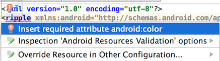
Select
Insert required attribute android:color. Also pass in the default touch feedback color and the shape of the button. The completed
ripple tag should look like the following:
<ripple xmlns:android="http://schemas.android.com/apk/res/android"
  android:color="?android:colorControlHighlight">
  <item>
    <shape android:shape="oval">
      <solid android:color="?android:colorAccent" />
    </shape>
  </item>
</ripple>
|
This provides an oval-shaped background with the animation effect for the button.
In
activity_detail.xml, add the following inside the
ImageButton tag:
android:background="@drawable/btn_background"
|
Here you’re instructing Android to use your new drawable as the background for the button.
Build and run. You’ll see a more prominent FAB that responds to touch with the ripple effect described above.

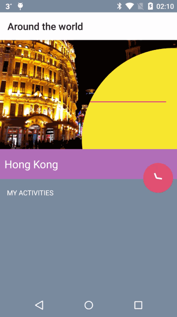
Adding a Reveal Animation
Now you want to give your users the ability to add notes about what
they’d like to do in each of these stunning places. For this,
activity_detail.xml already has an
edittext that is hidden by default. When a user taps the FAB, it reveals itself with a cool animation like below:

Open
DetailActivity. There are two methods you have yet to implement:
revealEditText()hideEditText()
First, add the following lines inside
revealEditText():
int cx = view.getRight() - 30;
int cy = view.getBottom() - 60;
int finalRadius = Math.max(view.getWidth(), view.getHeight());
Animator anim = ViewAnimationUtils.createCircularReveal(view, cx, cy, 0, finalRadius);
view.setVisibility(View.VISIBLE);
isEditTextVisible = true;
anim.start();
|
The two
int values are getting the
x and
y
positions of the view with a slight offset. This offset gives the
illusion that the reveal is happening from the direction of your FAB.
Next, the radius gives the reveal the circular outline that you can
see in the GIF above. All of these values — the x-position, y-position
and the radius — you pass into the animation instance. This animation is
using
ViewAnimationUtils, which gives you the ability to create this circular reveal.
Since the
EditText view is initially hidden, you set the view’s visibility to
VISIBLE and set your boolean check
isEditTextVisible to
true. Finally, you can call
start() on the animation.
To dismiss the view, add the following to
hideEditText():
int cx = view.getRight() - 30;
int cy = view.getBottom() - 60;
int initialRadius = view.getWidth();
Animator anim = ViewAnimationUtils.createCircularReveal(view, cx, cy, initialRadius, 0);
anim.addListener(new AnimatorListenerAdapter() {
  @Override
  public void onAnimationEnd(Animator animation) {
    super.onAnimationEnd(animation);
    view.setVisibility(View.INVISIBLE);
  }
});
isEditTextVisible = false;
anim.start();
|
Here your goal is to hide the view and show the circular animation in
the opposite direction. Therefore, you make the initial radius the
width of the view and the ending radius 0, which shrinks the circle.
You want to show the animation first and then hide the view. To do
this, you implement an animation listener and hide the view when the
animation ends.
Now build and run and see this animation in action!

Note: If the keyboard presents itself, you’ll need to
dismiss it explicitly to see the effect without obstruction. Oh, and
don’t worry that your button doesn’t show the plus icon yet, you’ll fix
that soon.
Morphing a Bezier Path for a Floating Action Button
Now that you have your reveal animation hiding and showing the edit
text field, you can coordinate the icon on your FAB to look and respond
just like the one shown below:
The starter project includes the vector paths for the plus and
checkmark icons. You’ll learn how to animate – or morph – the paths from
the plus to the checkmark, and vice versa.
Under the
drawables directory, create a new resource file by going to
New\Drawable resource file. Call it
icn_morph and define
animated-vector as the root element:
<?xml version="1.0" encoding="utf-8"?>
<animated-vector xmlns:android="http://schemas.android.com/apk/res/android"
  android:drawable="@drawable/icn_add">
</animated-vector>
|
animated-vector requires an existing
android:drawable. In this case, the animated vector will start with a plus sign and morph into a checkmark, so you’ll set the drawable to
icn_add.
Now for the actual morphing, add the following inside the
animated-vector tag:
<target
  android:animation="@anim/path_morph"
  android:name="sm_vertical_line" />
<target
  android:animation="@anim/path_morph_lg"
  android:name="lg_vertical_line" />
<target
  android:animation="@anim/fade_out"
  android:name="horizontal_line" />
|
With the code above, you are essentially transforming the vertical
line of the plus icon into a checkmark while fading out the horizontal
line, as the diagram below illustrates:
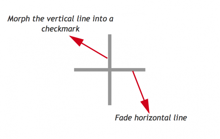
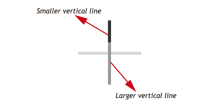
Furthermore, the vertical line is comprised of two paths, a smaller vertical line and a larger one:

You can see from the diagram above that you can transform the first two targets,
sm_vertical_line and
lg_vertical_line,
into a checkmark by drawing their paths at different angles, which is
exactly what you do in the previous code block, along with fading out
horizontal_line.
Next, you need to reverse this animation to transform the checkmark
back into a plus sign. Create another drawable resource file, this time
calling it
icon_morph_reverse, and replace it’s contents with the following:
<?xml version="1.0" encoding="utf-8"?>
<animated-vector xmlns:android="http://schemas.android.com/apk/res/android"
  android:drawable="@drawable/icn_add">
  <target
    android:animation="@anim/path_morph_reverse"
    android:name="sm_vertical_line"/>
  <target
    android:animation="@anim/path_morph_lg_reverse"
    android:name="lg_vertical_line" />
  <target
    android:animation="@anim/fade_in"
    android:name="horizontal_line" />
</animated-vector>
|
The two lines that make up the final vertical line in the plus icon
will now morph back into their original states and the horizontal line
will fade into view, creating a smooth effect.
Now, to complete the animation. Open
DetailActivity.java and add the following to
onClick(), just above the
if statement:
Here you’re declaring a field to hold a reference to the animatable
that will actually perform the animation. Now, add the following to the
bottom of the
if block:
mAddButton.setImageResource(R.drawable.icn_morph);
mAnimatable = (Animatable) (mAddButton).getDrawable();
mAnimatable.start();
|
Here you set the image resource of the button to the
icn_morph drawable you created earlier, extract the animatable from it, and then kick-off the animation.
Finally, add the following to the very bottom of the
else branch:
mAddButton.setImageResource(R.drawable.icn_morph_reverse);
mAnimatable = (Animatable) (mAddButton).getDrawable();
mAnimatable.start();
|
Here you’re doing almost exactly the same as the previous step, except you assign
icn_morph_reverse as the image resource so the animation plays out in the opposite direction.
Along with morphing the icon, the user’s click also adds the text from
mEditTextTodo to the
mToDoAdapter
and refreshes the place activity list. This is not yet visible because
of the white text, but in the next section, you’ll add vibrant color to
your views so that the text stands out.
Build and run, and watch the magic unfold before your eyes! The FAB
icon now morphs between a checkmark and a plus sign when it’s tapped.

Adding Dynamic Colors to Views Using Palette API
It’s time to add colors to this view using the Palette API. And not just any colors—as before, they will be dynamic colors!
In
DetailActivity, flesh out
colorize() by adding the following:
Palette mPalette = Palette.generate(photo);
applyPalette(mPalette);
|
Just like you did previously, you generate a palette from a photo –
although this time you do it synchronously – and then pass that palette
onto
applyPalette(). Replace the existing method stub for
applyPalette() with this code:
private void applyPalette(Palette mPalette) {
  getWindow().setBackgroundDrawable(new ColorDrawable(mPalette.getDarkMutedColor(defaultColor)));
  mTitleHolder.setBackgroundColor(mPalette.getMutedColor(defaultColor));
  mRevealView.setBackgroundColor(mPalette.getLightVibrantColor(defaultColor));
}
|
Here you’re you’re using the dark muted color, the muted color, and
the light vibrant color as the background colors of the window, title
holder, and reveal view respectively.
Finally, to kick-off this chain of events add the following line to the bottom of
getPhoto():
It’s that time again… build and run your app! You can see the detail
activity is now using a color scheme derived from the palette of the
associated image.
Activity Transitions With Shared Elements
We’ve all seen and wondered about those nice image and text
transitions in Google’s app which have been updated to use Material
Design. Well, wait no more—you’re about to learn the intricacies of
achieving smooth animation.
Note: Activity transitions, together with shared elements,
allow your app to transition between two activities that share common
views. For example, you can transition a thumbnail on a list into a
larger image on a detail activity, providing continuity of the content.
Between the places list view,
MainActivity, and the places detail view,
DetailActivity, you’re going to transition the following elements:
- The image of the place;
- The title of the place;
- The background area of the title.
Open
row_places.xml and add the following to the declaration of the
ImageView tag with an id of
placeImage:
android:transitionName="tImage"
|
And then add this to the
ImageView tag with an id of
placeNameHolder:
android:transitionName="tNameHolder"
|
Notice that
placeName doesn’t have a transition name. This is because it is the child of
placeNameHolder, which will transition all of its child views. In
activity_detail.xml, add the following to the ImageView tag with the id
placeImage:
android:transitionName="tImage"
|
And, in a similar fashion, add this to the
ImageView tag that has an id of
placeNameHolder
android:transitionName="tNameHolder">
|
Shared elements between activities that you want to transition should have the same
android:transitionName, which is what you’re setting up here. Also, notice that the size of the image, as well as the height of the
placeNameHolder
are much larger in this activity. You’re going to animate all of these
layout changes during the activity transition to provide some nice
visual continuity.
In
onItemClickListener() found in
MainActivity, add the following to the bottom of the method:
// 1
ImageView placeImage = (ImageView) v.findViewById(R.id.placeImage);
LinearLayout placeNameHolder = (LinearLayout) v.findViewById(R.id.placeNameHolder);
// 2
Pair<View, String> imagePair = Pair.create((View) placeImage, "tImage");
Pair<View, String> holderPair = Pair.create((View) placeNameHolder, "tNameHolder");
// 3
ActivityOptionsCompat options = ActivityOptionsCompat.makeSceneTransitionAnimation(MainActivity.this,
    imagePair, holderPair);
ActivityCompat.startActivity(MainActivity.this, intent, options.toBundle());
|
After adding this code, you will need to
manually add the import statement
import android.support.v4.util.Pair to the top of the file as Android Studio cannot automatically determine that this is the intended package.
There are a couple of things to highlight here:
- You get an instance of both
placeImage and placeNameHolder for the given position of the RecyclerView.
- You create a
Pair containing the view and the transitionName
for both the image and the text holder view. Note that you will once
again have to manually add the import statement to the top of the file: android.support.v4.util.Pair.
- To make the activity scene transition with shared views, you pass in your
Pair instances and start the activity with your options bundle.
Build and run to see the image transition from the main activity to the detail activity:
However, the animation is a bit jumpy in two areas:
- The FAB button suddenly appears in
DetailActivity.
- If you tap on a row under the action or navigation bar, that row appears to jump a bit before it transitions.
You’ll solve the FAB button issue first. Open
DetailActivity.java and add the following to
windowTransition():
getWindow().getEnterTransition().addListener(new TransitionAdapter() {
  @Override
  public void onTransitionEnd(Transition transition) {
    mAddButton.animate().alpha(1.0f);
    getWindow().getEnterTransition().removeListener(this);
  }
});
|
The listener you add to the enter transition is triggered when the
window transition ends, which you use to fade in the FAB button. For
this to be effective, set the
alpha to
0 for the FAB in
activity_detail.xml. Find the
ImageButton with a an id of
btn_add and add the following to its declaration:
Build and run! You’ll notice the FAB transition is
much smoother!:
As for the action bar and navigation bar issues, begin by adding the following to
styles.xml, inside of the
style tag:
<item name="android:windowActionBar">false</item>
<item name="android:windowNoTitle">true</item>
|
Since there is no action bar defined in
styles.xml, you’ll have to add it using individual XML views.
Open
activity_main.xml and add the following inside
LinearLayout, just above the
RecyclerView tag:
<include
  android:id="@+id/toolbar"
  layout="@layout/toolbar" />
|
This simply includes a toolbar layout that’s provided as part of the
starter project into the current layout. Now you need to make a similar
change to the detail activity’s layout.
Open
activity_detail.xml and add the following add the very bottom of
FrameLayout, just below the closing tag of the inner
LinearLayout:
<include
  android:id="@+id/toolbar"
  layout="@layout/toolbar_detail"/>
|
Next in
MainActivity, you need to create an instance of, and initialize the toolbar. Add the following field to the top of the class:
Next, set the value of the field in onCreate(). Add the following to the bottom of the method:
toolbar = (Toolbar) findViewById(R.id.toolbar);
setUpActionBar();
|
Here you assign the result of the
findViewById call to the new field, and then call
setUpActionBar(). At the moment it’s just an empty method stub. Fix that now by adding the following to
setUpActionBar():
if (toolbar != null) {
  setActionBar(toolbar);
  getActionBar().setDisplayHomeAsUpEnabled(false);
  getActionBar().setDisplayShowTitleEnabled(true);
  getActionBar().setElevation(7);
}
|
Here you set the action bar to be an instance of your custom toolbar,
set the visibility of the title, disable the home button, and add a
subtle drop shadow by setting the elevation.
Build and run. You’ll notice that nothing much has changed, but these
changes have laid the foundations of properly being able to transition
the toolbar.
Open
MainActivity and replace the existing
onItemClickListener with this one:
TravelListAdapter.OnItemClickListener onItemClickListener = new TravelListAdapter.OnItemClickListener() {
  @Override
  public void onItemClick(View v, int position) {
    // 1
    Intent transitionIntent = new Intent(MainActivity.this, DetailActivity.class);
    transitionIntent.putExtra(DetailActivity.EXTRA_PARAM_ID, position);
    ImageView placeImage = (ImageView) v.findViewById(R.id.placeImage);
    LinearLayout placeNameHolder = (LinearLayout) v.findViewById(R.id.placeNameHolder);
    // 2
    View navigationBar = findViewById(android.R.id.navigationBarBackground);
    View statusBar = findViewById(android.R.id.statusBarBackground);

    Pair<View, String> imagePair = Pair.create((View) placeImage, "tImage");
    Pair<View, String> holderPair = Pair.create((View) placeNameHolder, "tNameHolder");
    // 3
    Pair<View, String> navPair = Pair.create(navigationBar,
        Window.NAVIGATION_BAR_BACKGROUND_TRANSITION_NAME);
    Pair<View, String> statusPair = Pair.create(statusBar, Window.STATUS_BAR_BACKGROUND_TRANSITION_NAME);
    Pair<View, String> toolbarPair = Pair.create((View)toolbar, "tActionBar");
    // 4
    ActivityOptionsCompat options = ActivityOptionsCompat.makeSceneTransitionAnimation(MainActivity.this,
        imagePair, holderPair, navPair, statusPair, toolbarPair);
    ActivityCompat.startActivity(MainActivity.this, transitionIntent, options.toBundle());
  }
};
|
The differences between the original implementation and this one are thus:
- You’ve renamed the intent to provide more context;
- You get references to both the navigation bar and status bar;
- You’ve created three new instances of
Pair – one for the navigation bar, one for the status bar, and one for the toolbar;
- And finally you’ve updated the options that passed to the new activity to include the references to the new views.
Great! Build and run, and you’ll see a much smoother animation:
Now if you tap on a row under the action/toolbar or navigation bar,
it doesn’t jump before the transition; it transitions with the rest of
the shared elements, which is much more pleasing to the eye. Switch to
the grid view and you’ll notice that the transitions work very nicely
with that layout as well.
Ta-da! Here is a video of the final app in action:
Where to Go From Here?
Be proud of yourself: You’ve created a full-blown Android material app! To challenge yourself, try the following:
- Use
StaggeredLayoutManager to make a grid with three columns instead of two.
- Experiment with the
Palette API in both MainActivity and DetailActivity using different palette options.
- Add a button on the place list and transition it to the detail view as a shared element—perhaps a favorite button.
- Make those transitioning animations even cooler—check out Android’s
Newsstand app and see how it transitions from a grid to a detail view
with the reveal animation. You have all the code here to replicate that.
- Try to create all the morphing animations you did here, but using
animated-vectors.
And of course, apply this knowledge to your apps so that they can be as cool as this one. :]
To find out more about Material Design then be sure to check out Google’s recently redesigned
Google Design website.
You can get the full source code for this project on Github
here .
Feel free to share your feedback or ask any questions in the comments below or in the forums


0 comments:
Post a Comment
Note: only a member of this blog may post a comment.